Mister + Mrs Sharp Travel : Saint Tropez

On our trip to the South of France we stayed in the central location of Saint Raphael.  We took day trips to all of the places of note within close proximity.  Saint Tropez was first on the list.

Saint Tropez held a mystical, romantic place in our minds.  We had heard of the luxury, celebrities, boats, fashion and Diddy parties.  We didn’t know much more.  We just hopped in our fiat and set course for a beautiful day in Saint Tropez.

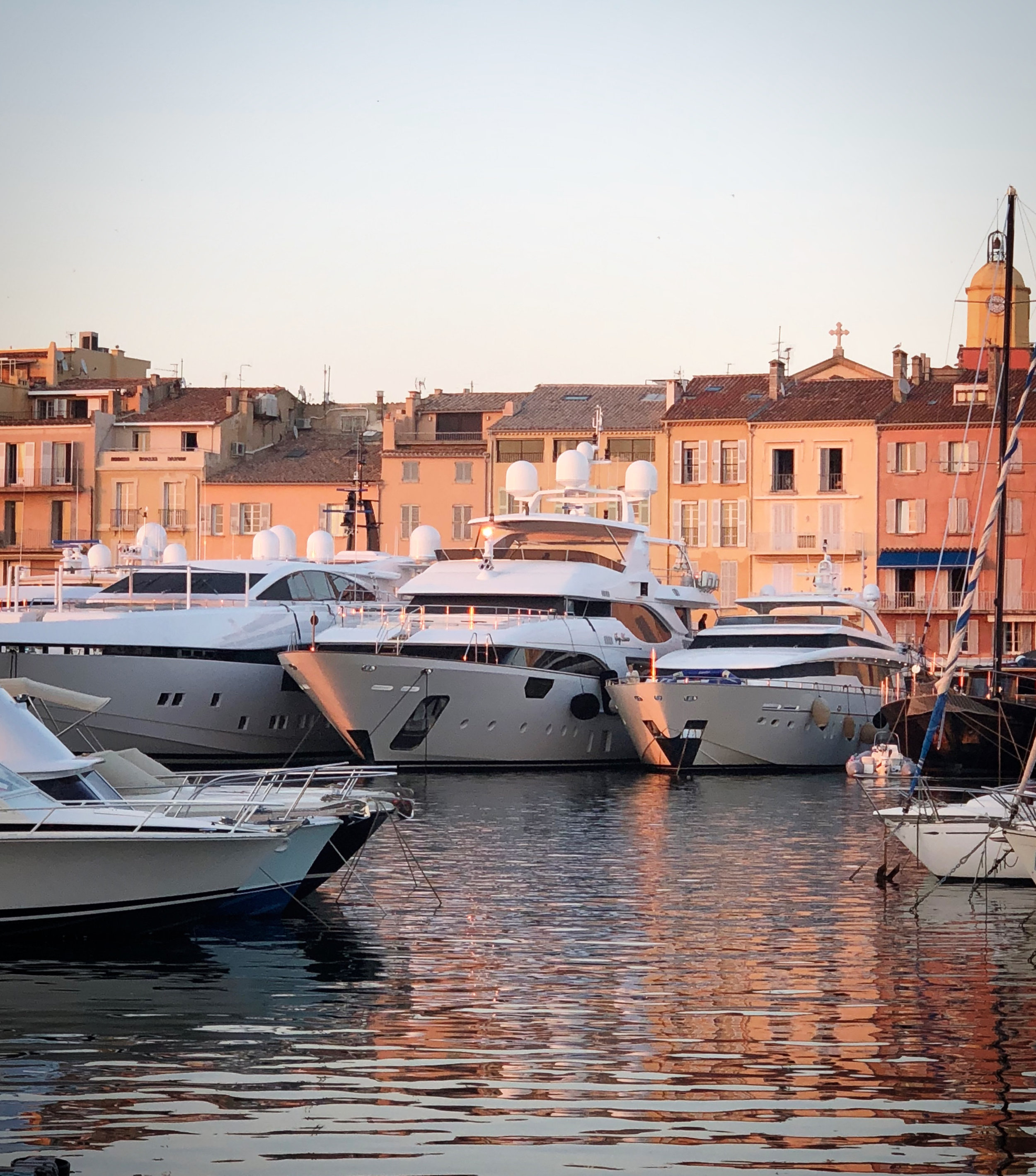
yachts.jpg

Upon arrival you immediately see the yachts. They don’t disappoint. We think it’s their juxtapostion with the old fishing village that makes them so grand.

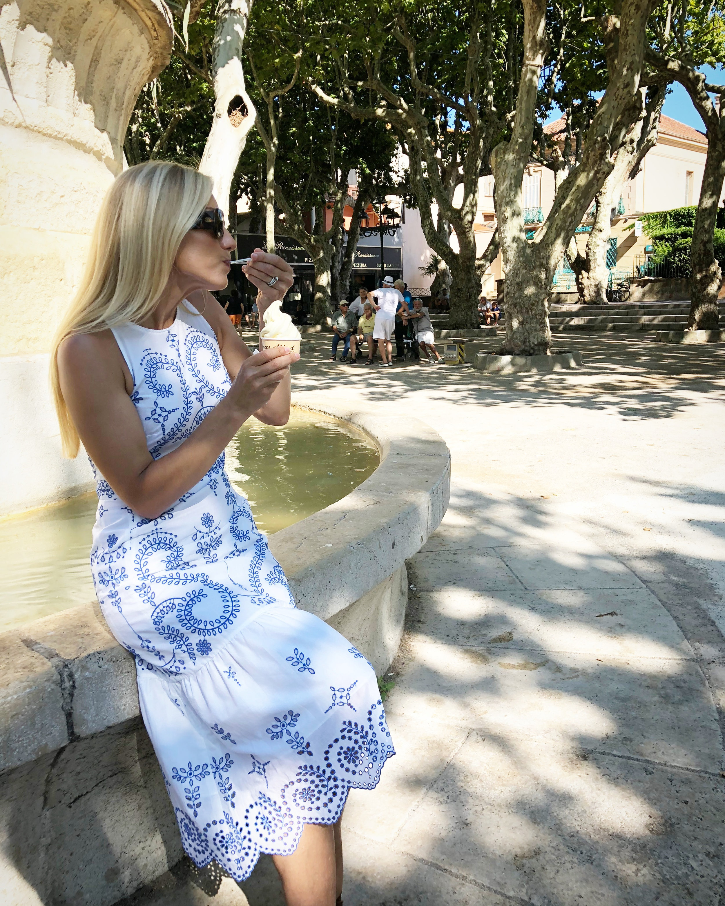
Bright Ice Cream.jpg

The “Place de Lices” is the city center and is surrounded by cafes and street vendors. It’s all you want it to be with some of the best people watching in all of Europe.

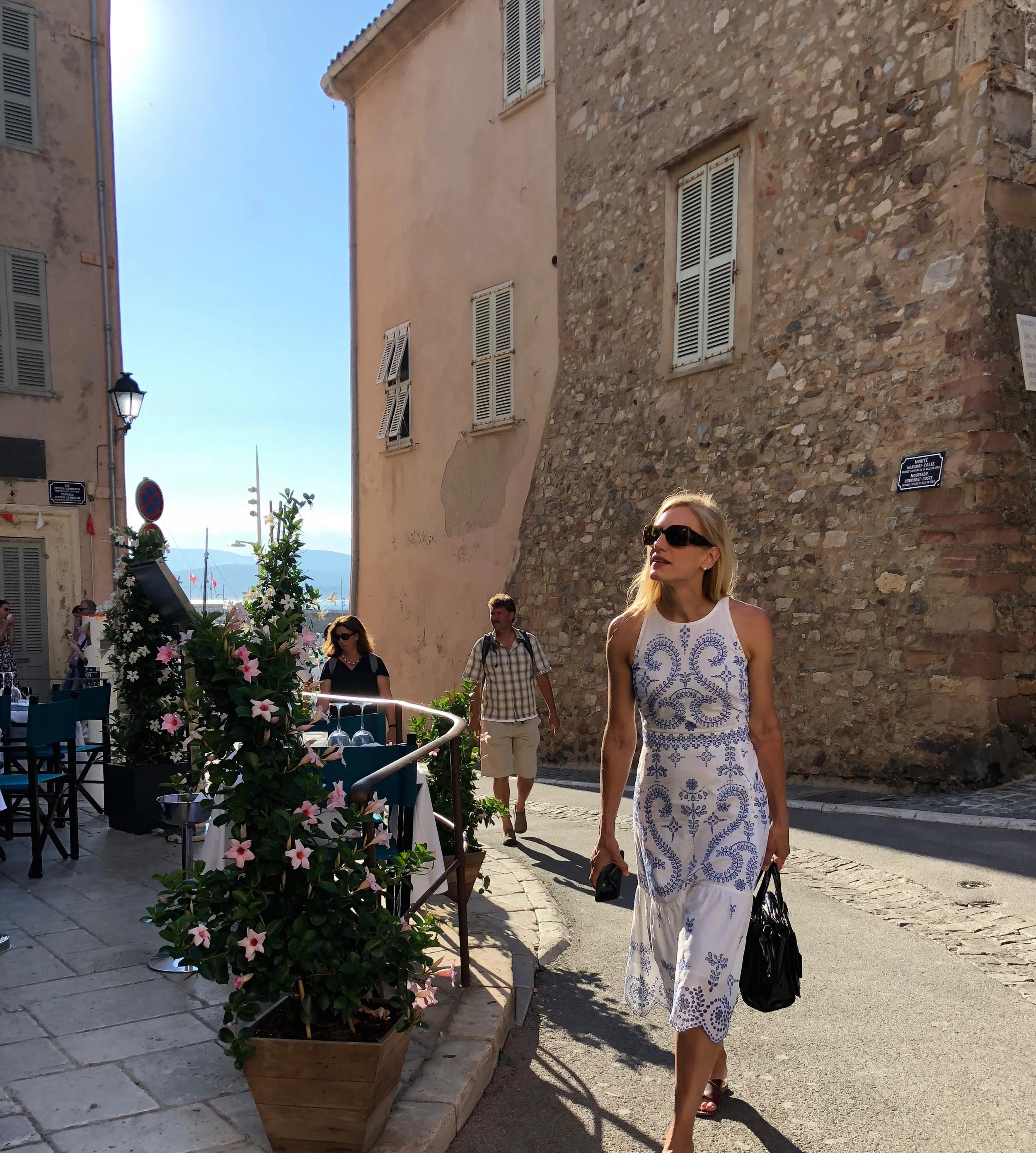
final walk.jpg

The town is lovely. A village of fashion. The oldest of buildings that house the finest of baubles and blouses.

final chanel.jpg

It seems that every major fashion house has a shop. We hit up most of them. Chanel felt like you were in Coco’s summer home.

just the two of us.jpg
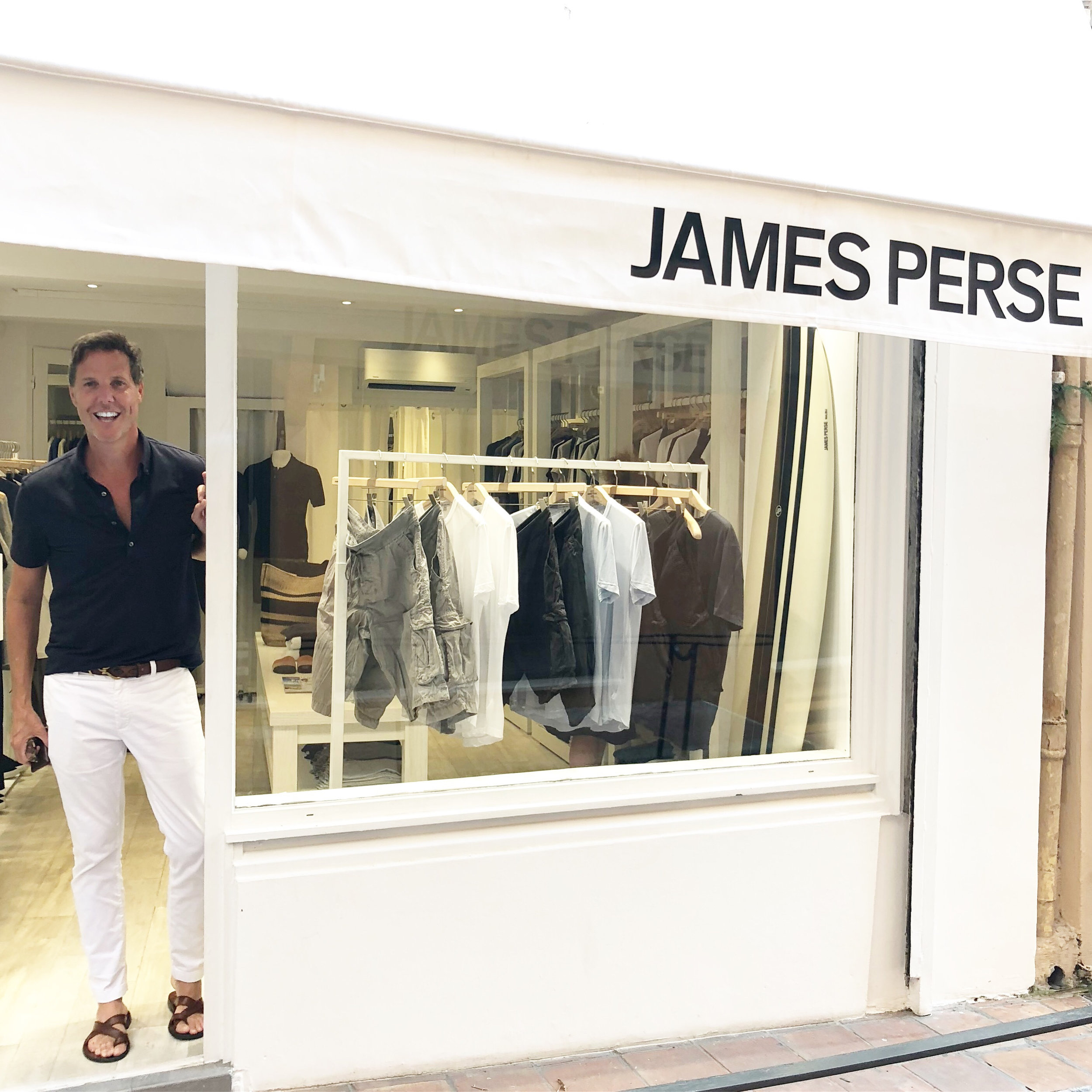
final james.jpg

We love a good t shirt. James Perse is not only our “go to” for soft knits but a design inspiration. Visit their Malibu and Marin locations and just see if you don’t want to take up residence.

Hotel Le Yaca

Hotel Le Yaca

restaurant street.jpg

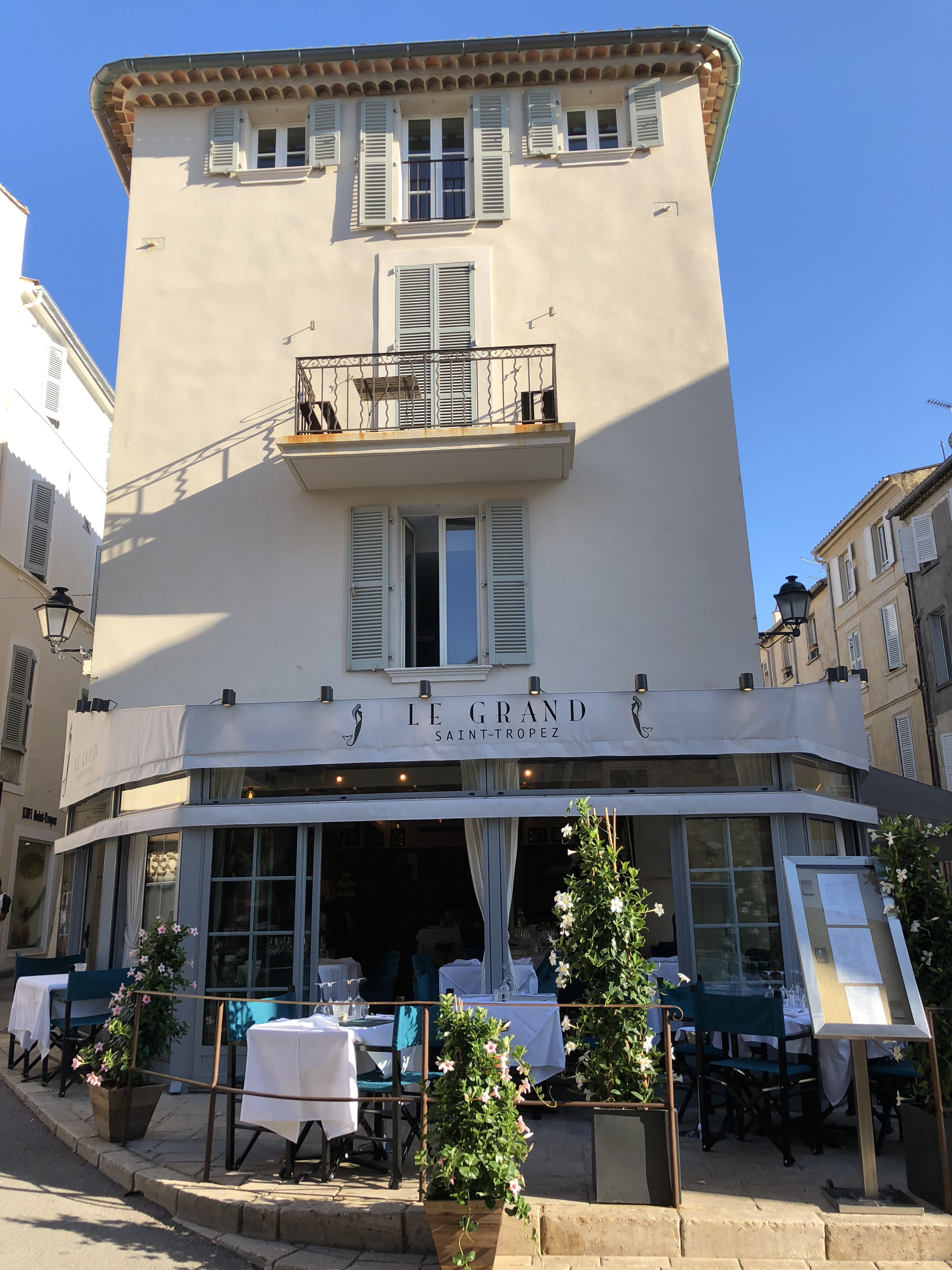
There was no shortage of restaurants. We searched high and low for menu’s that would please our pescatarian palette and of course an inspiring atmosphere.

le grand.jpg
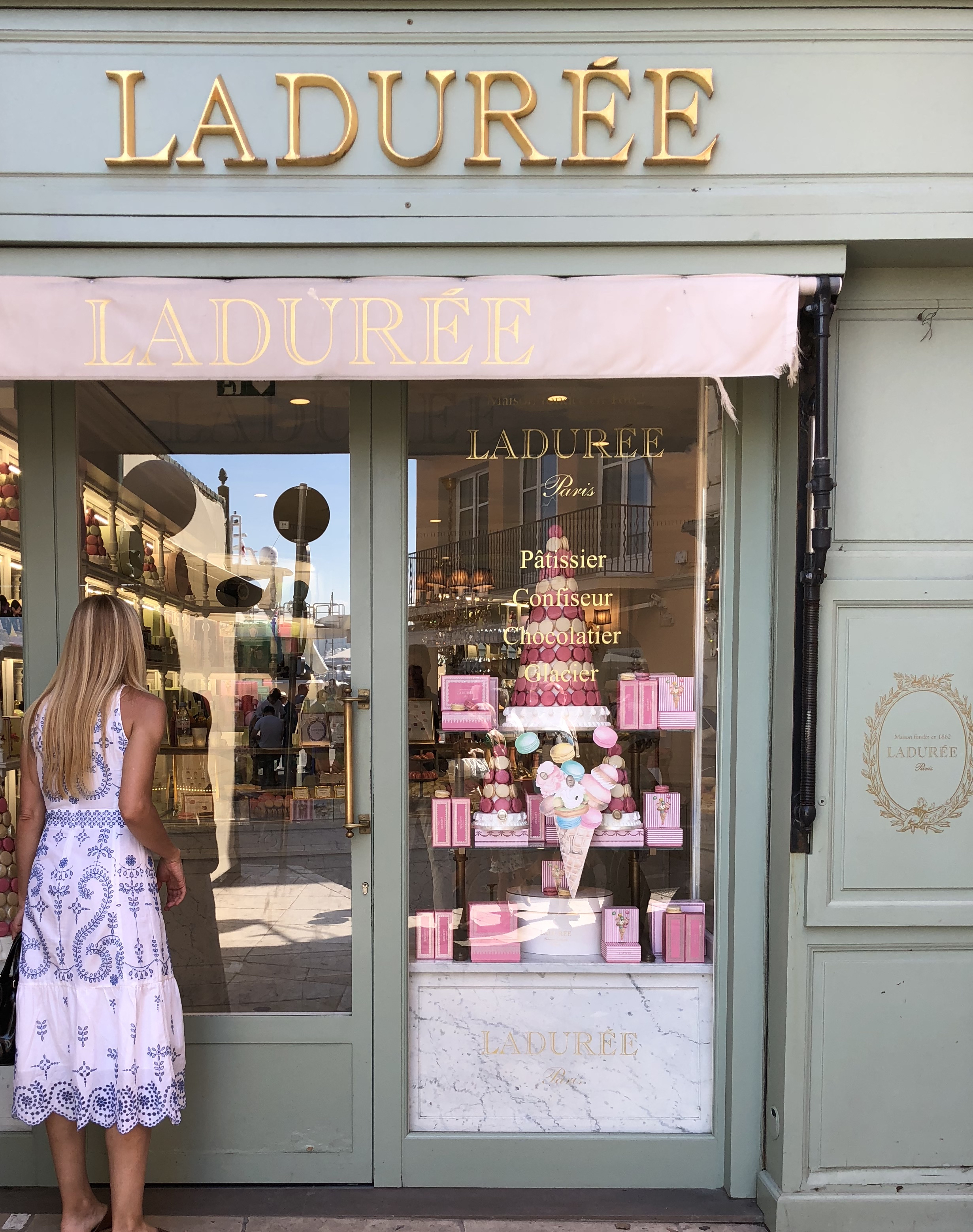
laudaree final.jpg

Saint Tropez has sea side outposts of your favorites from Paris.

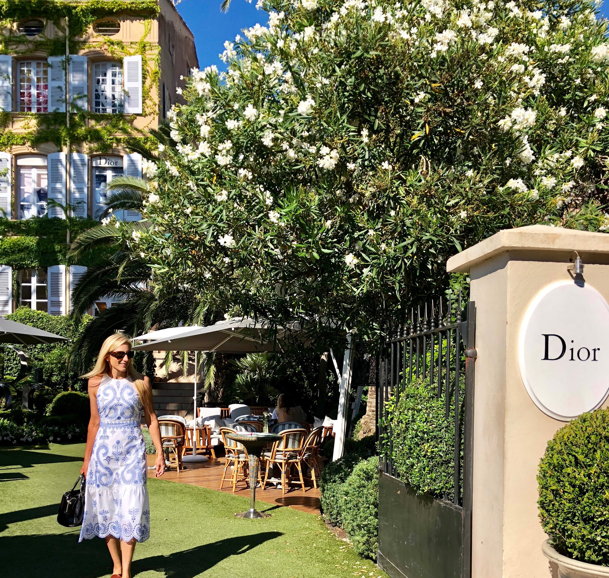
dior entrance.jpg

And so we come to our favorite spot in Saint Tropez. Dior. The Boutique, it’s courtyard and the restaurant Dior Des Lices. The setting is cinematic. Beautifully so. The shop and service are exquisite.

final dior 1.jpg

The boutique was our favorite combination of french paneling, marble fireplaces and modern furnishings. Not to mention Diors fall line. A little bit french country. A little bit rock and roll.

Dior 3.jpg
final patio.jpg

The weather was kind to us. Sunny, the bluest of skies and 80.

final plate.jpg

And then there was dinner. Seafood by the sea in the most chic surroundings. The table settings and the garden were equally stunning. The Garden Design is Peter Wirtz.

Table.jpg
our table.jpg
White fish.jpg

The food was exceptional. The menu is by three Michelin star chef Yannick Alleno.

14 rue Francois Sibilli, Saint Tropez, Provence-Alpes-Cote d’Azur, 83990, France

food1.jpg
Salad.jpg
Meg look up.jpg
final sun set .jpg

There are a few places that need a second visit. We will find our way back to Saint Tropez.

Dixon Rye

photo: anthony masterson

photo: anthony masterson

We've enjoyed getting to know the city of Atlanta.  A sizable city with design conscious citizens. One of the coolest neighborhoods that has developed over the last 20 years has been the Westside Provisions District.  A district of beautiful design shops with some of the cities best apparel retail (Sid and Ann Mashburn, Billy Reid) and restaurants (JCT, Marcel) among them.  And smack dab in the center of this area, Dixon Rye has risen. 

We are excited to share a conversation with the founder and owner of Dixon Rye, Bradley Odom.

M+M - We love your aesthetic. The idea of Raw and Refined, together. Can you tell our readers a bit about how that developed?

DR - I landed on these words to describe the brand before I opened, and I loved how they felt and sounded together, but our eventual brick and mortar shop, a 1943 building that served as an Iron Foundry provided the perfect backdrop to visually communicate this aesthetic. Our physical space provides the raw, with soaring ceilings, the original crane and pulley systems, concrete walls, and weathered, hardwood floors. Because of this, we are uniquely positioned to play with the juxtaposition of humble materials (steel, wood, concrete), with luxe and soft materials (linen, cashmere, velvet). But even in the most refined spaces, there can be raw or humble materials that add to the mix of raw and refined.

photo: sarah dorio

photo: sarah dorio

M+M - “Quiet decency” is a defining phrase for your brand. We love the sound of it. For us it feels “comfortable and elegant”. The combination of which we would want to buy into. What else does it mean to you?

DR - Quiet Decency is a visual inspiration of the things I love myself that I think reflect Dixon Rye. It also feels quiet in that there’s no sales or promotional component to the email. Our inboxes are full of noise, and we wanted this to feel like a breath
of quiet inspiration. When we get compliments like, "I read Quiet Decency with my morning coffee", or "Thank you for bringing more beauty to the world", that inspires me to keep going! I've always been a visual learner and have always taught from the point of inspiration, so QD is a great outlet

M+M - What came first for Dixon Rye? Design or commerce? How do they overlap?

DR - I’m a retailer at heart. Curating the shop has been a dream, but curating the assortment in the homes of our customers that is unique to their life and experiences has always been a component of the vision. There’s something about being a shopkeeper that inspires me. I get to work with our customers on a daily basis. I learn from each one about where and what we do next. That isn’t to say the design part of our business isn’t important—it is. I get to extend what we do in the shop into peoples homes.

M+M - What was the moment when you said to yourself ... “I’m going to start a brand”?

DR - I’ve always been inspired by the opportunity to create an endeavor from the ground up, and I can’t say that there was one “aha!” moment; it’s been an awareness for as long as I can remember. I do have one memory of standing in my favorite store in Birmingham at the age of 26 and specifically knowing that I wanted to have my own home store one day. I’ve been fortunate in my career to witness the development of brands from ideation to inception to execution and have always known the dream was to do this with some of my own ideas. Having worked for J. Crew, West Elm and others, the idea of a “shop” to me while it may only be one, always equaled all of the tangibles and intangibles that go into creating a brand. Earning a degree from SCAD several years ago was one of the final pieces of the puzzle I wanted to complete before going full steam ahead with Dixon Rye.

photo: anthony masterson

photo: anthony masterson

M+M - We’ve enjoyed multiple interactions with the fine folks on your team. It is always a pleasure and they are always engaged. Will you share a bit about how to build a successful team?

DR - I’ve always believed that you shouldn’t hire anyone you wouldn’t share a drink or meal with, and that rule has served me well.
I think the push for brick-and-mortar shops to innovate to keep up with e-commerce is overthought and overcomplicated. Of course we focus on innovation in terms bettering all points of consumer engagement, but at the end of the day, it seems like the most innovative thing that we can do is to honor the legacy of the small shop owner. We build relationships, we serve beverages, we send thank you notes, and at the end of the day we make friends, who are our biggest brand ambassadors. My team and I share (and often revisit) this same philosophy; in terms of in-store client relationships, we focus more on intention than innovation.

photo: anthony masterson

photo: anthony masterson

M+M - You are from a small town in Mississippi. How has that influenced you?

DR - I was born and raised in a small, rural town in Mississippi, but have also lived in several distinctly different southern towns: New Orleans, Birmingham and my long- time home, Atlanta. The rich heritage of the South informs not only how I design, but also how I work with clients: family first, entertaining, outdoor/indoor living, lush greenery, inviting spaces and personal stories reflected in everyday objects.

M+M - How did you make your way to Atlanta?

DR - The long and winding road of retail, of course.

photo: sarah dorio

photo: sarah dorio

M+M - What do you see as the biggest trends in home design for Atlanta over the next 5 years?

DR - You know, I try not to dive too much into trend forecasting, however, I can tell you what I would like to see. I would love the use of more color and modern done well. I think modern gets a bad wrap in the South because of how modern sometimes gets translated. The word alone tends to scare some people. Modern can be approachable. Doesn’t have to be cold. Those who pull it off understand the mix, scale and editing of design. Throw in that antique chest, it helps to ground some of the more modern choices!

M+M - We appreciate the name “Dixon Rye”. How did you come up with the name for your company?

DR - I wish the story was more glamorous than, “We were unable to obtain the full rights to the original name that’s been part of this process for years”, but that’s the truth. Several months before the shop opened, we had to go back to the drawing board. With the creative support and assistance of several of my friends, colleagues and mentors, the fictitious character of Dixon Rye was born.

I wanted the name to have a southern influence without being 'hokey.' Dixon was taken from Mason Dixon and Rye was inspired by Catcher in the Rye, or whiskey, depending on who you ask.

M+M - What is in the near future for you and your brand?

DR - In the next month we’ll expand our online offerings to a full e-commerce site, so that’s been our biggest focus this year. We’re also approaching our third anniversary, so I felt like it was time for a full website update. It’s time for this to happen, and it’s been our biggest labor of love in 2018; I can’t wait for you to see it.

M+M - What are the long term goals for Dixon Rye?

DR - I want to pace our growth and make sure that we’re really committed to the excellence of our small brand before it becomes a bigger one. I think having a e- commerce site will dictate our next steps in regard to photo studio, design office, warehousing—all the behind the scenes things. We’ll also continue to develop our own private label collection into other categories.

photo: sarah dorio

photo: sarah dorio

photo: sarah dorio

photo: sarah dorio

Pencil and Paper Co.

We are in awe of Pencil & Paper Co.   A design team with big and effortless style.  They are colorful and happy and inspiring.  They have been an inspiration to us since we discovered their Instagram a few years ago.  We met at an event in Atlanta shortly thereafter. We've met a couple of times now and they are as kind and fun as they are stylish.  The following are images of the dynamic duo and some of their work.  We are honored to have a conversation with Gennifer and Benjamin Sohr. 


Photo: Leslee Mitchell

Photo: Leslee Mitchell

We like to think we have a lot in common with Pencil & Paper Co.  Not only are Gen and Ben a husband and wife design team but they also have an affinity and connection to Nashville,  they met and worked together at Gap Inc. and they left a life in San Francisco for the South.  

Photos: Leslee Mitchell

Photos: Leslee Mitchell

Gen and Ben are not afraid of color and pattern.  They want the spaces they create to be happy.  We have to say that our happiness level rises just looking at their work. 

Photos: Leslee Mitchell

Photos: Leslee Mitchell

They are media darlings.  The work of Pencil and Paper Co. has been featured in countless magazines including House Beautiful, Southern Living, Better Homes and Gardens, Good Housekeeping and Domino Magazine. 

Photo: Lauren Bradshaw

Photo: Lauren Bradshaw

Unknown.jpeg
Photo: Lauren Bradshaw

Photo: Lauren Bradshaw

The Conversation

M+M - As a husband and wife team, are there areas of any given project of which you work separately?

P+P - When running a small business there's so much to cover. While we overlap on big picture decisions and strategy, we typically take the "divide and conquer” approach to daily work. We have identified each of our roles based on
our strengths and how they compliment one another.

Benjamin and I both lean towards the creative at heart. Fortunately, Benjamin also has a strong analytical side too. Benjamin leads new business development, our corporate client relationships, and all things operational and financial. I lead the creative team on all projects including: residential, commercial and retail design, brand collaborations, product development, and marketing/social media.

M+M - We’ve heard you speak of your use of color and pattern as bringing “happiness” to a project. Have you always been about color? Or has your use of color evolved?

P+P - I think as creatives we are always evolving – always being influenced by new experiences. We certainly still love color and pattern and that will always be at the core of our brand DNA. Yet, I think "our style" is, of course, ever moving forward and growing. That’s what is most exciting to us!

M+M How did the two of you meet?

P+P - We met in 1995, at the start of our careers while working to help launch Old Navy brands in San Francisco.

M+M - What brought you to Nashville?

P+P - Benjamin was born and raised in Nashville. He is the youngest of 4 boys with a very large extended family that all live here. After working in corporate America and living in San Francisco for 10 years, we were ready to get back to family and start our own business. Nashville felt like the perfect move.

M+M - What are your top 5 favorite things about Nashville?

P+P - Southern Hospitality

          Knowing that you will never leave the house without running into a friend

          Wonderful and inclusive creative community

          Easy access to travel

          An abundance of old school “Meat + 3’s”

M+M - Is Nashville your forever home?

P+P  -  I think we will always have a home base here in Nashville. But, we secretly love the idea of living abroad at some point or having a little Harbor Island escape (goals!).

M+M - Every photo we see of your family is always so stylish.  It’s inspiring.  We think folks would like to know – is there ever a moment where things don’t seem so stylish?  Could you give an example?

P+P -  If only you could see my office desk right now – hello, DISASTER!  The creative process is a messy one.  Nothing is perfect all of the time. We are parents and business owners, so nearly every second of the day is filled, but, glad that’s the impression!

M+M - We’ve heard you speak of taking the leap from corporate employee to business owner – approximately how long after you started your business did you leave the corporate world?

P+P - We left corporate America in 2003 to make the move to Nashville. Initially we continued to travel and consult with big box retailers on Brand Development and Customer Experience. But, after completing several personal home renovations that we were lucky to have featured in Domino, Southern Living, and Better Homes and Garden we made the leap into a full-time design business. Pencil & Paper Co. was officially born in 2013.

M+M - It seems that your creative development company, has many creative outlets: Interior design, architecture, fashion, entertaining, lifestyle etc. What is the most inspiring to you currently?

P+P - I think we have trouble narrowing down what we love most. That’s probably why we touch so many different creative areas! I think interiors, fashion, travel, entertaining – a love of beautiful things, all go hand in hand.

M+M - You’ve had so many exciting projects and accomplishments! What’s next for you?

P+P - Ah, thank you! It's been a whirl wind couple of years. Sometimes it’s hard to believe that our team has grown to 10 full time employees in such a short amount of time. In addition to a packed schedule of design projects from Kentucky to NYC, we're particularly focused on getting out there to meet people face to face! We have a crazy travel schedule this year, filled with some really fun design events and speaking engagements!

M+M - What are your goals for the company?

P+P - So many (mostly top secret)! At the top of our list this year? Delving into into Pencil & Paper Co. product! Be on the look out later this year!

Photo: Tec Petaja

Photo: Tec Petaja

Behind the Scenes: Atlanta Homes & Lifestyles Show House

We were thrilled to be a part of the Atlanta Homes & Lifestyles Designer Showhouse, right here in our own neighborhood of Serenbe.

A fabric tape balanced this bold wallpaper to a comfortable, preppy glamour. Custom abaca rug by Mary McDonald from Patterson Flynn Martin. All Photos by J Ashley Photography.

A fabric tape balanced this bold wallpaper to a comfortable, preppy glamour. Custom abaca rug by Mary McDonald from Patterson Flynn Martin. All Photos by J Ashley Photography.

Set on a European-inspired square in Serenbe’s newest neighborhood, the showhouse featured the amazing work of 12 Atlanta designers. Each individual space had its own designer. We had the privilege of styling the downstairs hall and powder room – areas of the home that are often forgotten or under-designed. Not this time.

The wallpaper is Schumacher Iconic Leopard and the art is by San Francisco artist Chloe Meyer.

The wallpaper is Schumacher Iconic Leopard and the art is by San Francisco artist Chloe Meyer.

For us, it was all about making a big impact in a small space. We used bold pattern, texture and accessories to make a statement from the front door. 

We added an antique knife holder from William Word Antiques atop a simple white pedestal as the centerpiece of the space.

We added an antique knife holder from William Word Antiques atop a simple white pedestal as the centerpiece of the space.

Open shelving was used as a beverage station. We decked it out with home accessories from Bungalow Classic and barware from Dixon Rye.

Open shelving was used as a beverage station. We decked it out with home accessories from Bungalow Classic and barware from Dixon Rye.

In the powder we added a Miles Redd for Ballard Designs mirror and an Eames walnut stool.

In the powder we added a Miles Redd for Ballard Designs mirror and an Eames walnut stool.

This handsome fellow made a big impact and reflected the nature just steps away.

This handsome fellow made a big impact and reflected the nature just steps away.

IMG_0973.JPG


Check out this video to see the before-and-after details.

Set The Holiday Table

The holidays are a time we gather around the table with friends and family.  Make it special.  Here is some inspiration. 

Gwyneth Paltrow - Elina P for Fashiongoesrock.blogspot.com

Gwyneth Paltrow - Elina P for Fashiongoesrock.blogspot.com

Gwyneth goes natural with pinecones. Silver trimmed dishes keep it festive. 

Mark D Sikes - Photo: Joe Schmelzer for OneKingsLane.com

Mark D Sikes - Photo: Joe Schmelzer for OneKingsLane.com

The king of blue and white keeps true to form for the holidays.  Add some red flowers and viola. 

Danielle D Rollins - Photo by Sara Hanna for danielledrollins.com

Danielle D Rollins - Photo by Sara Hanna for danielledrollins.com

For Thanksgiving we love this plaid table cloth chosen by local tastemaker and one of Southern Livings Most Stylish 50 People, Danielle D Rollins.

Nina Holst for Stylizmo

Nina Holst for Stylizmo

White works for every season.  Nina Holst shows us how to keep it simple with a single wreath at every setting. 

Mister + Mrs Sharp - Photo by Patrick William Sharp for misterandmrssharp.com

Mister + Mrs Sharp - Photo by Patrick William Sharp for misterandmrssharp.com

Martha Stuart says, "Nothing is difficult if you have the proper tools."  The same could be said about setting a proper table.  Our friends at Hudson Grace have made it easy.  They have beautiful things.  All the tableware pictured above and in the video below came from their beautiful new store in the Westside Provisions District of Atlanta.   We've been shopping with them since our time in San Francisco and are thrilled they are down south.